Wise Roots Wellbeing
Rebecca James Alsum is owner of Wise Roots Wellbeing.
As a certificated Sexologist and Sex Coach, Rebecca helps her clients find health within a vulnerable and private aspect of their life. What a special honor and unique challenge to communicate this within design!

Rebecca’s brand reflects much of who she is; how she shows up for the clients she supports. She has a presence of profoundly gentle, feminine strength. Her heart is open and strong; her communication is flowing and kind.
We focused on elegant simplicity: monochrome design, minimal mark, spaciousness, fluid movement to communicate the values of this business.
What we designed subconsciously communicates a sense of choice, of ease, freedom / non-confinement, sensuality, intimacy…
That there is space for all to engage, to approach from different angles.

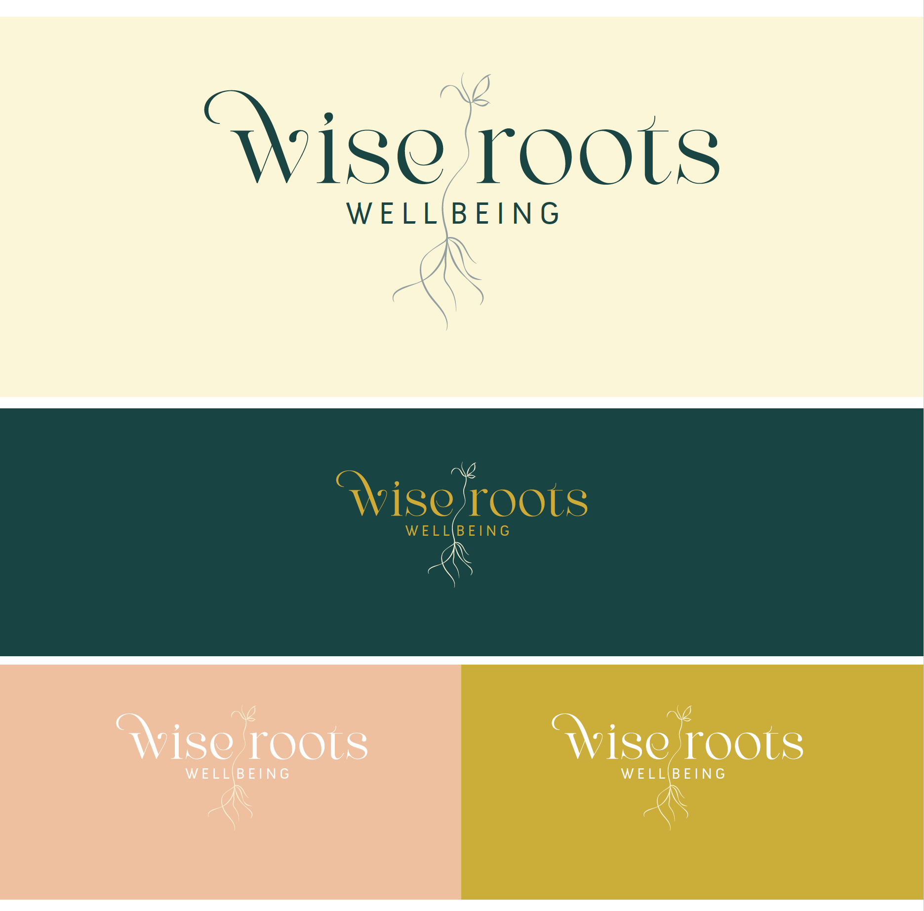
Rebecca came with a clear color concept. Here are some color variations for the Wise Roots Wellbeing brand, which can be used in different settings or different seasons.
Typography:
I love the confident curves of the “wise roots” script with some flourish, grounded by the foundational presence of “wellbeing”.
The modern serif font of “wise roots” is one I took much care in selecting for its sweet details.
We love the flourish on the “w”, the curve of the “e”, the elegant “t”, and the “s” which begins with an organic drip, and ends in such a balanced way with the stable serif heel.
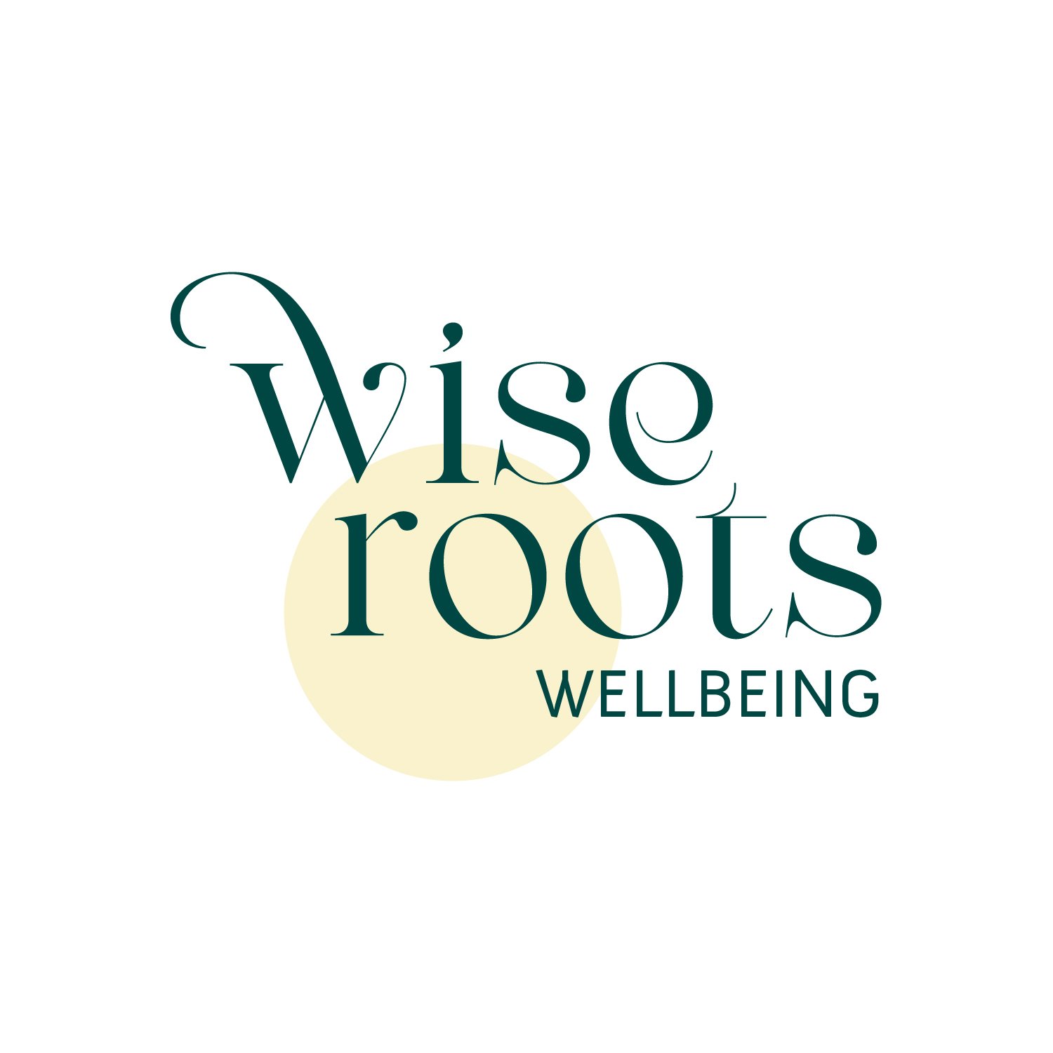
Watch me really geek out:
The plant itself is a complete life. It has a full root structure which is planted beneath the soil (visually) of the word “wellbeing”. The root structure is robust, unapologetically free flowing, wild.
There is a crossing over of roots which feels relational to me; it also creates the shape of a yoni in its intertwining.
The main stem meanders in a deliberate but unworried way -- up -- to reveal two leaves, one of which mimics the yoni shape from the roots below (reminiscent of a butterfly resting as well), and two stems.
At the very top, the two stems show the willingness for continued growth, and of course, a symbol of two people in relationship.
Alternative Designs
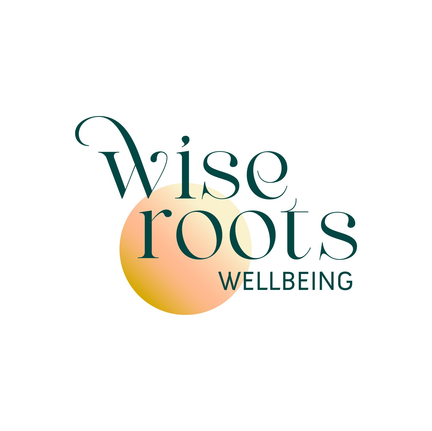
We were able to create some fun (and still brand consistent) alternatives for letterhead and special elements.